

Moco.ai
Moco.ai had the foundation. It needed a visual language to bring the brand to life.
Earlier this year, I developed the brand style and visual language for Moco.ai, a US startup helping unify fragmented back-office operations in the insurance industry. The brand already had a strong strategic foundation, but it needed more definition; a clearer visual language and practical tools to bring the brand to life consistently and confidently.
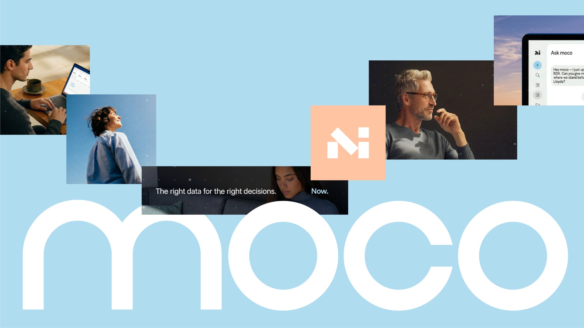
The challenge was to make a highly technical product feel human: optimistic, empowering and full of possibility, rather than cold or intimidating. The answer came from a simple idea: people are at their best when technology brings out the best in them.
Moco helps users find the right data, at the right time, to make the best decision. We represented that support through a visual motif we called the “shimmering net of data” — a dynamic layer of intelligence that surrounds and supports people as they work.
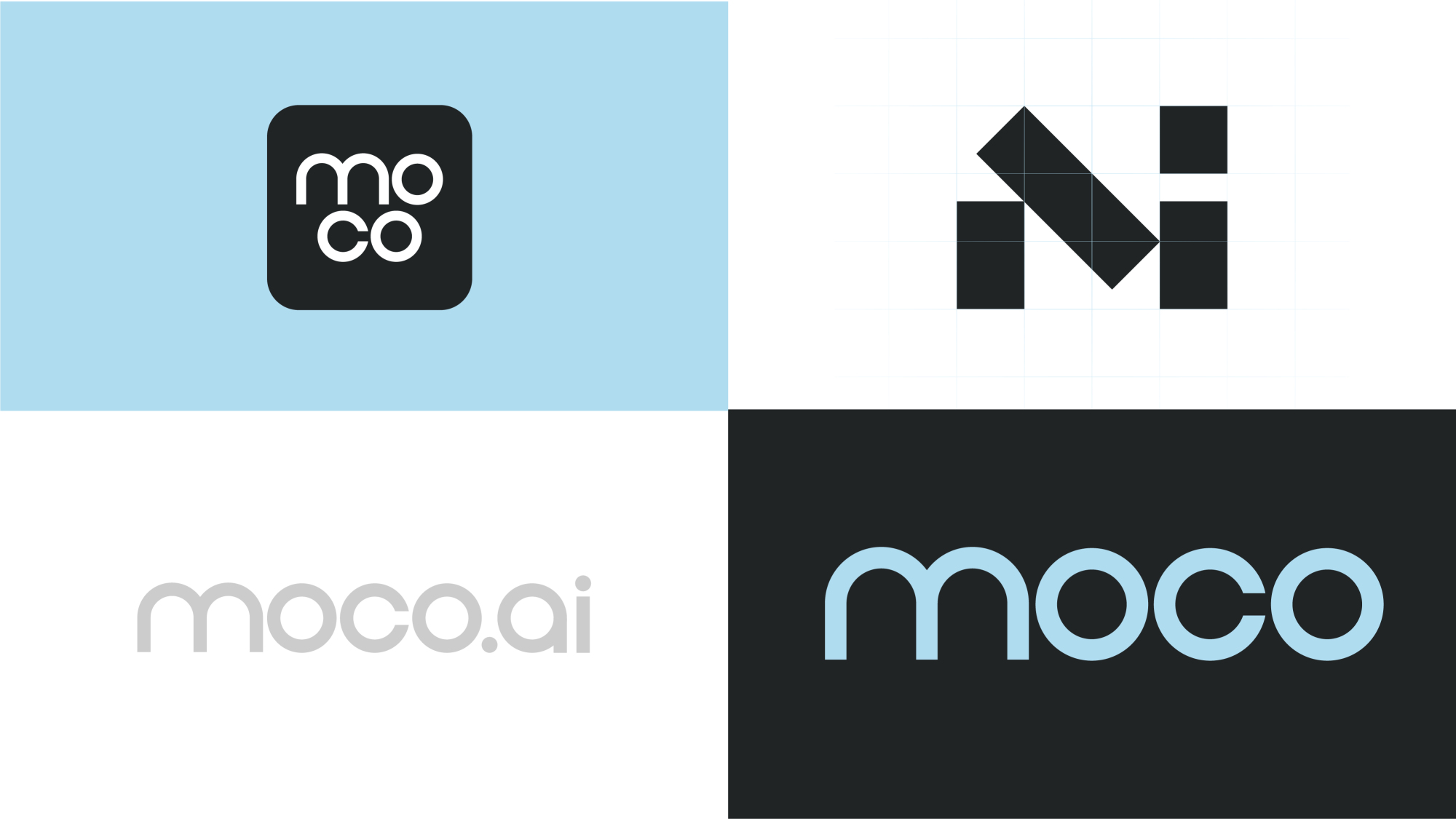
Alongside the visual language and brand motif, I also evolved the logo and typemark, giving Moco a more distinctive and confident expression.
The result was a brand system that didn’t just define what Moco should look like, but gave the team the tools to actually make it happen.


Our project included the production of Moco's launch website.
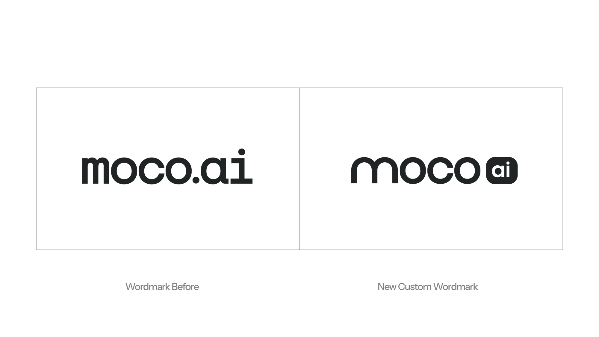
Part of the brand work involved evolving the initial logo and wordmark into a more distinctive, ownable solution.
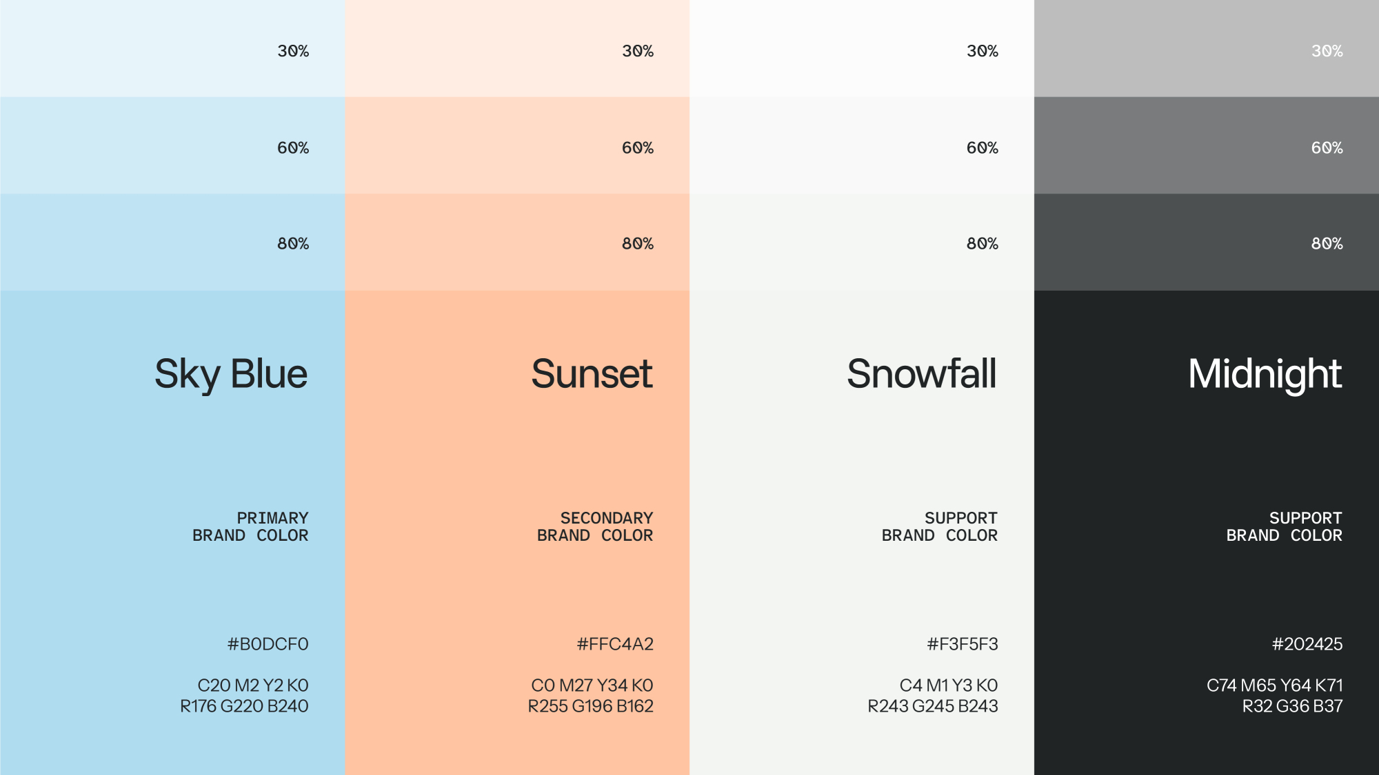

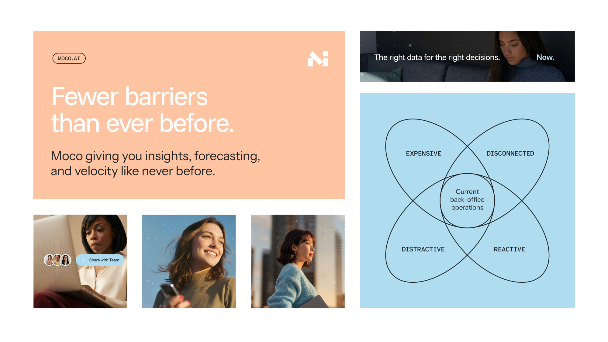
Our new Moco brand applications present a human first, native-AI platform that elevates the insurance back office experience.